
Color Psychology
Jan 9th 2018
4 Ways to Turn Color Psychology Marketing into Customers:
Looking to add a pop of coloration or pigmentation to your operation? Believe it or not color psychology marketing may be what’s keeping you from customer growth. Color is the very first thing people will notice when introduced to your business. Why not make it impressionable and unforgettable?
Now I know what you’re thinking….
How could the colors I pick for my business possibly be that important? Can’t I just find one or two that look nice and call it a day? Well, you could, yes. But you would be doing yourself, your business, and your customers a great disservice. Every aspect of your business should leave a lasting effect, and as the visuals give the first impression of your company to your target market the real question is: can you afford not to think of it as that important?
Did you know….
According to colormatters.com, 60% of the time, people decide whether they are attracted to a message solely based on color.
Now that sounds like a pretty big deal to me. So how do you get to know color psychology and marketing? Credibility, Visibility, Readability (yes, it’s a word), and Reflectivity will not only increase your working knowledge but may allow you to make changes that can greatly increase the traffic for your services. So let’s get started.
http://www.color-wheel-pro.com/pics/gsinfographic1(color)large.jpg
large.jpg)
Credibility
This is calling a color into question. What colors mean what? How do you know what colors work best together? How many colors is too many colors and why does this even matter? This section will take us through the basics of color credibility and associations.
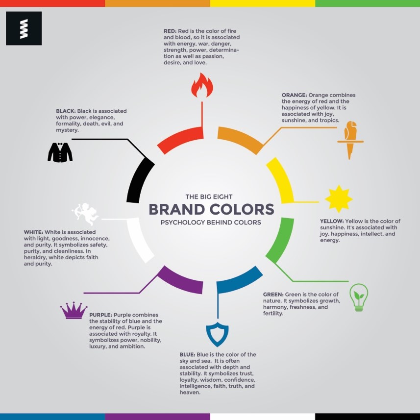
WHITE- considered to be the “color of perfection,” it invokes feelings of light, goodness, purity, innocence and virginity. White is also one of the more prominent Neutral colors along with Grey and generally works well as reverse text. Companies that use White primarily: Nintendo Wii, Apple, Wikipedia
BLACK- gives off a sense of power, elegance, formality, death, and mystery. Another excellent background choice, Black has an air of sleek sophistication and maturity while working primarily as a Neutral color. It also enhances other colors you use by making it bolder. Companies that use Black primarily: Nike, PlayStation, Cartoon Network
RED- A warm, primary color, Red makes people think of danger, energy and passion. Associated with blood and heat, it creates desire in the minds of your customers and has even been known to increase a person’s heartbeat and cause excitement. Fun fact: red is the first color our eyes learn to recognize as babies. ( http://www.bausch.com/vision-and-age/infant-eyes/eye-development ) Companies that use Red primarily: Target, Coke, Netflix, Lego
YELLOW- Great for grabbing attention, Yellow is joyous, hopeful and intellectual. It’s a warm, primary color with the ability to evoke feelings of laughter and happiness and can add a sensation of cheer and optimism. The only problem with yellow is that too much on its own can appear overwhelming to the senses, so it’s best to use coupled with other colors, sparingly. Companies that use Yellow primarily: Post-It, McDonald’s, Sprint, Nikon, IMDb
BLUE- carries a lot of special qualities, maybe more so than any other color. It has the shortest wavelength on our visible color spectrum and follows behind green and yellow as the easiest to see during the day. Emoting trust, loyalty, faith, truth and wisdom, blue gives off a friendly, sociable vibe and is often recommended to be worn when taking the stand in court for the above mention qualities. It also is a color most associated with banks. Companies that use Blue primarily: Facebook, Pepsi, Twitter, Capitol One
PURPLE- The color of luxury, ambition, dignity, and magic. A rare color to appear in nature and reproduce on fabric, it was historically reserved as a color of nobility, along with shades of blues and reds and now these colors make people think of royalty, honor and status. Companies that use Purple primarily: Yahoo, Hallmark, FedEx, LA Lakers, (the late, great) Prince.
GREEN- The easiest color on the human eye during the day, green inspires possibility and is often associated with growth, nature, harmony, freshness, and healing. Green does have its drawbacks visually, however. Certain shades or hues of green can evoke a feeling of sickness or spoiling. Be sure to test the color out before committing to it. Companies that use Green primarily: Animal Planet, Whole Foods, Xbox, Starbucks
ORANGE- A perfect “Call to Action” color, orange is all about motivation, enthusiasm, stimulation, encouragement and happiness, often creating a sense of hunger. You can see this color used in gyms like the aptly named Orange Theory. It evokes fascination in people and makes them want to buy or subscribe to services. Companies that use Orange primarily: Nickelodeon, Harley-Davidson, Penguin Books, WMBA
PINK- Cute, innocent, soft, feminine and carefree are usually words linked to the color pink. But this is mainly an American take; when looking at other cultures around the world like India or Japan, colors take on a completely different meaning, and it’s great to think about this from a business standpoint. Pink also is the symbol of hope strength and the determination to fight, like with Breast Cancer Awareness. Confectionery and romance just scratch the surface with this stimulating color. Companies that use Pink primarily: T-Mobile, Mary Kay, Victoria Secret
BROWN- gives off an earthy, warm, rustic and stable sensation making you think of coffee, chocolate, or wood. This neutral color is often associated with all things organic and evokes a feeling of connectivity to the earth. It is also a popular choice in restaurants and bars. While not as celebrated as many of the other colors because it tends to be a bit boring by comparison, you shouldn’t count this color out. It makes a great substitute for black and can be complimented by other colors like orange, yellow, or green. Companies that use Brown primarily: UPS, J.P. Morgan, Hershey

Check out the article “ Why Facebook Is Blue: The Science of Colors in Marketing” for a more in depth break down on colors and how they are used to affect our purchases. General word to the wise: take a look at your competitors color schemes and see if you can steer clear of what they are going with. The last thing you want is to accidentally drive traffic to someone else’s business because customers confused their company for yours.
Visibility
So now you have a better understanding of colors. So what? Obviously the article would be over if it was a simple as knowing what colors make you feel what way to get more customers. The key there is visibility: people not just looking at but seeing what you have to offer them.
Clothing is a great example. Busy afterschool programs and child care facilities often have their employees wear high visibility clothing with bright and attractive colors discernible from most backgrounds to make it easy to identify and distinguish them from other adults and even higher ranking staff members. Hunters, cyclists, and highway workers use reflective properties to be seen in low lit areas for safety.
Here’s what I mean…
Some studies show that fluorescent clothing is 5 ½ times more visible than conventional clothing. E.G. with florescent clothing a driver will see the object from 670 meters away instead of 120 meters with standard clothing ( http://avip.pocsports.com/colors-contrast).
This is in large part due to contrast between the brilliance of the florescent coloring against everything else. Contrast gives the brain visual clues, ultimately resulting in an earlier and more informed decision on the identity of an object. Color intensity and the background comparison to that color are very important when it comes to visibility. Put simply, it’s got to stand out.
Homework Time (Yay)!
Time to take a look inward at your business to learn more about visibility. Go have a look at your logo, brand design, or letterhead. Do this up close and far away. Have a friend or co-worker do the same thing. What do you see, or don’t see? Can you tell immediately what your company does? How can you drive that point home? This may be a simple as changing the size or enhancing the shades to make things easier to read. Which brings us to our next point.
Readability
Congrats! You’ve caught the attention of many a potential customer with your knowledge of colors and how to put them together. But can they get any information about your business from a quick glance? 4 seconds is all you have before the brain decides to move on, so you have to make sure that your client base gets what they need in that short amount of time.
What makes something readable ?
Visibility is one of the factors of readability which we’ve covered a bit here. Others include reading speed and perceptibility at a distance. Your typography choice, or the size, placement and orientation of your font, effects how people are able to process whatever information you put before them. Wiki tells us that as of the year 2000 readability formulas have been made to increase the likelihood of processing words at a faster, more comprehensible rate. One in particular is the Fry Readability Formula used in early education and in healthcare to ensure publications have a level of readability that is understandable and accessible by a wider portion of the population.
Eye movement and blinking also are huge parts to readability. It is important to know that the eye doesn’t actually read anything, what it’s really doing is scanning; scanning for information and how to process it. This is important because we process information differently at different ages and through the perspective of different cultures (in Japan they read right to left, in America we read from left to right). Keep this in mind to help drive sales towards your target market.
Reflectivity
This is where hues, tints and shades really come in handy. White will be the most reflective color so when you add white to a color you’re effectively increasing the brightness of said color. Subsequently Black is the least reflective so when you add black to a color you are effectively shading said color. Hue deals with the specificity. While Blue is a color “baby blue” and “indigo” are hues.
Did you know…
According to National Geographic, Women are better able to discriminate among colors like knowing the difference between plum, grape and sangria (hues often used in selling cosmetics), while men are prevalent in discerning detail from a distance, like reading billboards easily while driving on the highway.
So there you have it!
Basic working knowledge of color psychology and marketing! You have to admit it was worth all the rhyming. Take this guide and links inside and grow your customer base with knowledge and pride! (Sorry, couldn’t resist.) As always, happy signing!