
Learn About Typography
Jun 27th 2018
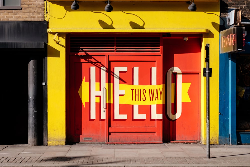
When You Learn About Typography, Your Signage Will Boost Your Business
Let’s Face It:
Odds are if you are great at providing a service or product and good at running a business then you probably aren’t so great with typography. And why would you be? Few people outside of the design industry have even the most rudimentary working knowledge of its functions and most set aside a budget to hire a designer to handle it. But what if I told you the way your signage looks-- the typography you choose—could drive traffic straight to your business?
Sounds silly? It’s not.
According to research done by FedEx, 80% of consumers said they entered a store or business they had never visited before based simply on its signs. 75% told others about a business based on its signs. 60% believe that a business’ signage reflects the quality of its products or services and 50% indicated poor signage (e.g. poorly made, misspelled words) deters them from entering a place of business.
What’s the bottom line?

Your signage matters! And making sure it fits your business’ audience, services and quality will help your business grow. But what you are just starting out and don’t have a clue where to even begin? While I can’t make you a typography guru over the course of this post, I can provide some tips and basics to boost the power of your signage.
The Best of the Basics:
Typography, coming from the Greek typosand graphia, means “impression writing” however, I like to look beyond its literal definition and think of typography as “writing that leavesan impression” as it applies to the style, arrangement and appearance of letters, numbers and symbols as well as encompasses advertising, book covers, signs, brochures, logos and branding, packaging and labeling just to name a few while appearing as elegant as calligraphy or as abstract as graffiti. Its importance online cannot be understated and is often given the distinction of being the cornerstone for web design, and web presence is a big deal for small businesses. Basically it comes down to the font, size, and colors you choose that set the tone for your signs and your company.
Here’s What I Mean.

There are three factors you should always be concerned with for your signs: Legibility, Readability, and Consistency. These refer to the way our eyes process information; how we see things separately, as a whole and how we come to recognize and associate emotions and information, respectively. These factors are controlled by font size, typeface design, setting, color and placement. Take a moment to scroll through the various font faces that are in your Microsoft Office. You’ll see variations of the same font; the changes can be slight, or to the common eye virtually unchanged but specificity when it comes to these outwardly trivial details can drastically affect the look and overall feel of your sign.
Know What You Want And How To Ask For It
Another thing about typography is, more likely than not, you are getting its terms confused. Even when employing someone with experience to create your logo or letterhead, it can delay results and agitate your designer when you don’t know how to properly communicate the look and feel you want. Put simply, if your typeface was a painting the font would be the type of paint used.
For an easy go-to definitions guide for typography terms, I recommend “A Beautifully Illustrated Glossary Of Typographic Terms You Should Know” by Janie Kliever on canva.com which provides excellent point of reference images so you can visualize the importance of the 34 basic terms.
“Typography is like fashion, or furniture. With rare functional exceptions, the world doesn’t “need” new clothing of furniture designs, but people want to look for different or evoke a particular feeling or fit with particular “look,” and there are trends and styles. While true innovation is rare, people consistently come up with variations on existing themes, or combine existing elements in new ways, whether in type design, clothing or furniture”—Thomas Phinney
You May Be Wondering…
“How can I apply this to my business?” A great place to look for ideas is websites for services in your market. Look through the eyes of a potential customer and see what draws your eye or pulls your focus. How is the sign meant to be read? Is it easy to get information about what the business is? How do the colors make you feel? See what things you like and make note of the things you’d like to avoid.
When choosing a style and font that works for your signage the first thing you want to think about isyour business. What do you provide and who do you provide it to? Are your services strictly business or casual? Is it hard hitting or whimsical? Who do you want to appeal to?
For Your Consideration
“Business should strive to create great products that are memorable and one simple way to do that is by using consistent, minimal, and considered typography”-Jake Cooper of Jake Cooper Designs
Picking a font and style takes consideration. With only 4 seconds to make an impression before the eye moves on to more information, figuring out the best ways to utilize the space you have will do most of the work for you. Studies have shown that all lower case text is more legible than all upper case text as lower case letters are visually more distinct. Upright type is easier to read than italics and contrast plays a key role in cohesion.
Trying to keep a minimal look may be difficult when you have big ideas or a lavish product but there are subtle ways which prove more effective than striking colors and imagery. When limiting apply the three-two-three rule; up to three colors, two type faces and three fonts and sizes to find the most affective combination to please the eye.
If All Else Fails…

You can find fonts online! There are entire sites dedicated to no cost fonts but you run a higher risk of finding another business with your designs and the comparison may change how you feel about them. A quick google search can show you a range of 100 to $400 per font so decide whether or not it’s a profitable for your business long term to find room in your budget for someone else to do the work for you.
Whether you decide to dig a little deeper on your own or it’s less stressful to orchestrate your design, widening your understanding of typography, the way we see words, will actively stimulate web presence and boost traffic to your services. Let your sign be your guide! Happy Signing!
Looking to create a new logo with flare or brand your product? Speedy Pros is your one stop source for all your local printing needs. Visit myspeedypros.com for promotions!